


Angela Baroni. Type design. 2021 – Present, Antwerp.
This is an ongoing typographic revival I started at the Expert Type Design Course at the Plantin Institute in Antwerp, under the supervision of Frank E. Blokland. It is based on the work of Angela Baroni, a Venetian letter engraver from the 18th century. It will be released as a large type family by CAST.






Fugazzi Face. Graphic Art. 2020, Madrid.
I took a picture of an ID photo with my phone, then opened it in Photoshop. I took it so close to the screen though, that the result was beautifully blurry. Many Photo ID’s of colleagues, friends and family followed from there. There is an IG account dedicated to it.

Hear it roar. Graphic Art. 2018, Madrid.
We are constantly surrounded by things that reveal new possibilities, new angles, new perspectives. Chose wisely. Bend your ego. Hear it roar. 50x70cm Gliceé print available upon request. Get in touch.

Ford. Type design. 2022, New York.
Ford is based on the body text type found on Henry Ford’s book Today and Tomorrow, published in Madrid in 1931. It has been my revival project for the 1st term at Type@Copper Extended at the Cooper Union university in New York.

Ford. Type design. 2022, New York.
Ford is based on the body text type found on Henry Ford’s book Today and Tomorrow, published in Madrid in 1931. It has been my revival project for the 1st term at Type@Copper Extended at the Cooper Union university in New York.


Madonaperra. Brand identity. 2015, Madrid.
Madonaperra. Brand identity. 2015, Madrid.
Custom lettering for an artist from Salamanca. He has been doing this tumblr called Madonaperra for more than a decade now and has gained thousands of followers ever since. madonaperra.tumblr.com
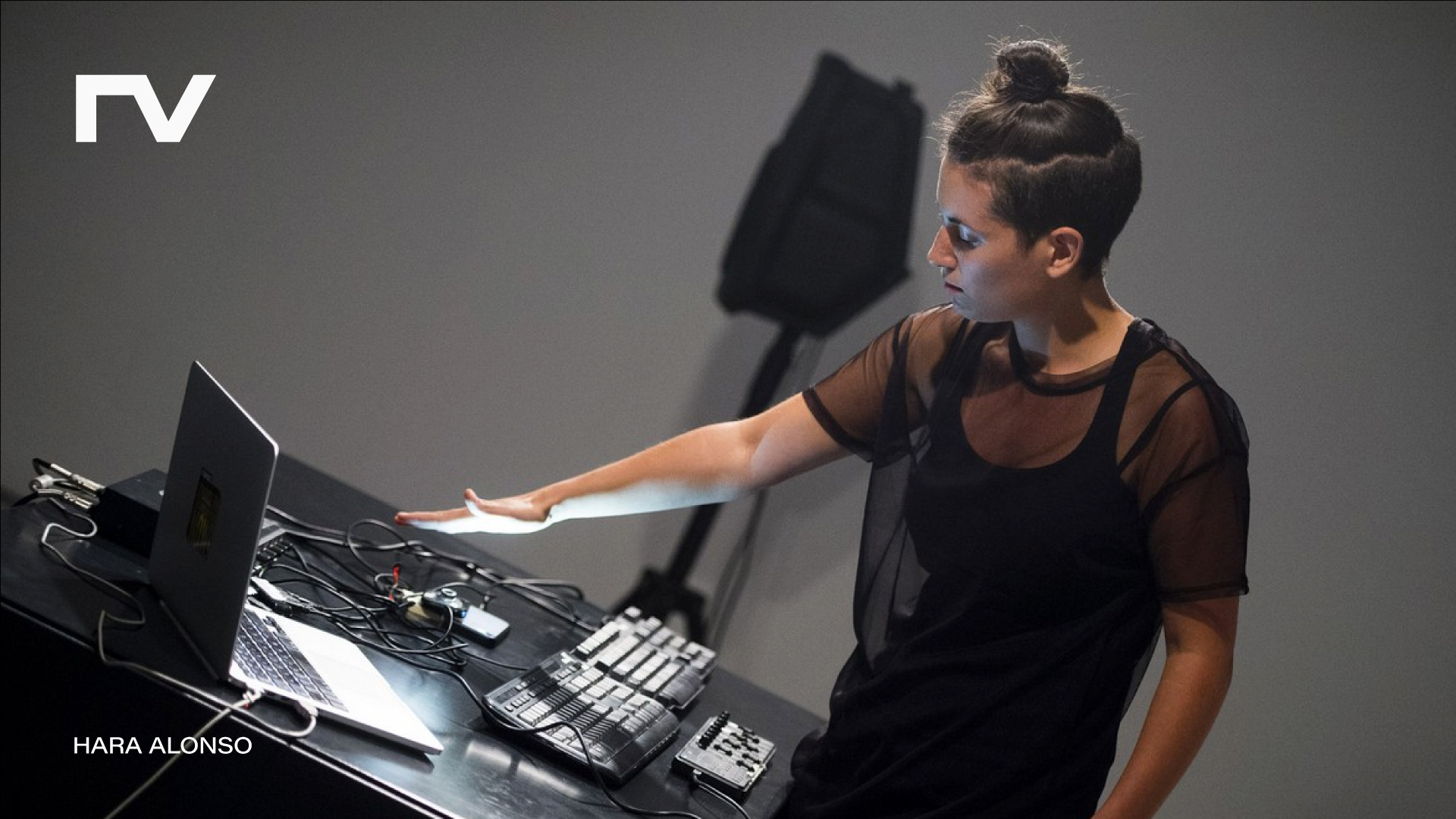
Ruido Vírico . Brand identity. 2020, Madrid.
This is a Twitch musical event that saw the light at the beginning of the lockdown. It broadcasts musicians from all over the world performing from their home studios. Video: Javier Melgar / Music: Hara Alonso.
Ruido Vírico . Brand identity. 2020, Madrid.
This is a Twitch musical event that saw the light at the beginning of the lockdown. It broadcasts musicians from all over the world performing from their home studios. Video: Javier Melgar / Music: Hara Alonso.
Ruido Vírico . Brand identity. 2020, Madrid.
This is a Twitch musical event that saw the light at the beginning of the lockdown. It broadcasts musicians from all over the world performing from their home studios. Video: Javier Melgar / Music: Hara Alonso.


Nexus. Graphic Art. 2016, London.
An introduction to crystallography, by F.C. Phillips was a book from my dad’s library that made an impact on me when I was a kid. These are prints I designed remembering those moments. They are 23×23cm Gliceé Matt prints in 235gsm. Contact me to request one or the whole series.


Mysore House Madrid. Brand identity. 2021, Madrid.
I built the identity of Mysore House Madrid, a reference in the practice of Ashtanga yoga in Spain. The symbol is a bridge between the two cities, Mysore and Madrid. Photos: Adolfo Ruiz Maeso
Mysore House Madrid. Brand identity. 2021, Madrid.
I built the identity of Mysore House Madrid, a reference in the practice of Ashtanga yoga in Spain. The symbol is a bridge between the two cities, Mysore and Madrid. Photos: Adolfo Ruiz Maeso

Dutch Games. Graphic Art. 2014, London.
Op Art is the ultimate visual sophistication. These pixels explode and implode creating a pattern that was suitable for the creation of a delicious 120x120cm foulard. In production. Stay tuned.

La Negra. Brand identity. 2017, Madrid.
Although “La Negra” translates as “I am Death”, I also wanted to play with the typically happy/sad gesture of drama companies. My take on this was simple and memorable, like the stagings of this drama company.
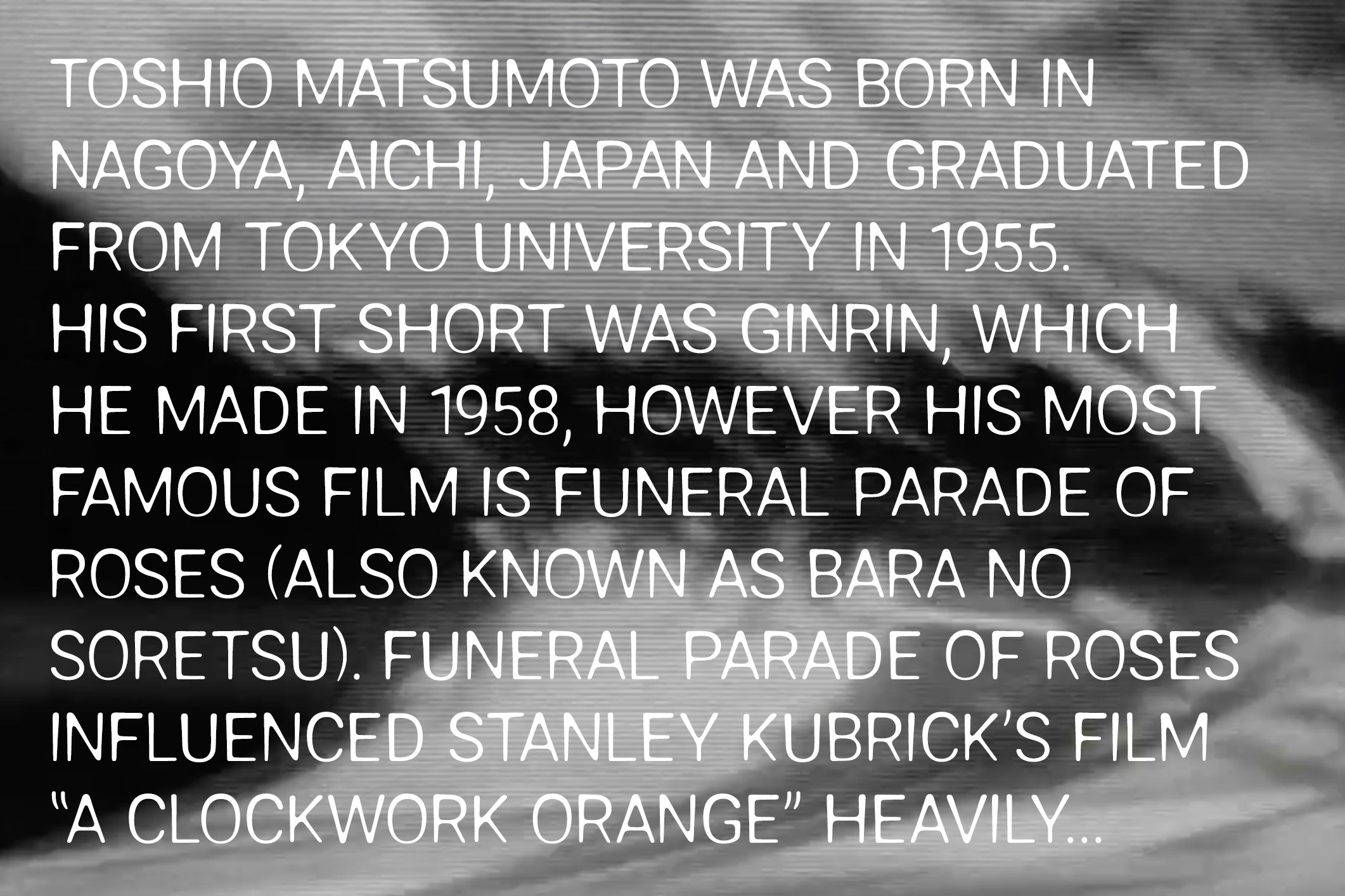


Toshio. Type design. 2019, Madrid.
This typeface was initially executed with Tinka Font, and App to make fonts out of drawings or photos you take with the camera. In this case I took pictures of Helvetica regular which came out in way more interesting shapes than the original. Available to download for free here (no commercial use).

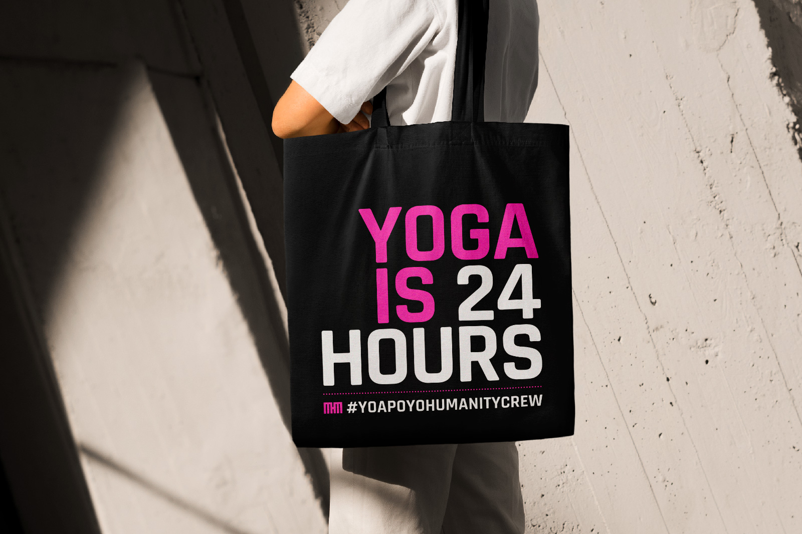
Yoga is 24 Hours. Brand identity. 2022, Madrid.
Yoga is an attitude, a way to understand yourself and what is around you all day, not only when you practice the postures (asanas). I helped spreading this message with this merchandising made for Mysore House Madrid. All the revenue goes to the courageous charity Humanity Crew.


Atonal. Type Design. 2023, New York.
This is the personal project development of the Second Term at Type@Cooper. It is a typeface that wants to achieve the confidence of a slab serif while transmitting certain friendliness.
Vanta. Brand identity. 2019, Madrid.
I made this identity for Vanta, a creative coder based in Berlin. Two ideas got in the way to create this symbol: the refraction of light and the punched cards from early computers.

Coco Records. Brand identity. 2015, London.
Wordmark for a record label specialised in dub techno. It comes alive when the records plays. Hover it and dance (put the music in your imagination)

Do not. Graphics. 2016, Berlin.
While living in Berlin, my command of the German language was not as good as to say with words “please stop slamming the door”. So I decided to create this graphic for the inconsiderate neighbour we had who did this as part of his annoying rutine. Thank God, visual language can be universal.

Alain Melgar. Brand identity, Bern, 2017.
Probably this is the perfect example of ‘make it bigger’ applied to a logo I have ever designed. It was for Alain Melgar, an IT solutions business based in Bern, Switzerland.
Do not. Graphics. 2016, Berlin.
While living in Berlin, my command of the German language was not as good as to say with words “please stop slamming the door”. So I decided to create this graphic for the inconsiderate neighbour we had who did this as part of his annoying rutine. Thank God, visual language can be universal.
